Sunday 24 February 2013

Summary of AF105

I really enjoyed this project. Video is one of my passions and one of my favourite things to do. I like creating an idea/storyline then thinking about how best to portray whats in your head visually. It is making thoughts, ideas and themes tangible in a way that is different to all other mediums of digital media. I also love the post production segments in After Effects. Colour grading and visual effects. This project gave me a great chance to put all of these ideas to use in a way I haven't really tried before.

What I will take forward:

This has been the first project where I was already familiar with the programs I was to be using, the process of creation and the content to be included within it. This made it strange and familiar although it was new. This also meant that I had already stretched my wings and cut my teeth on this subject and so there wasn't much new to learn and take away. I suppose the focus on researching the person who made the speech and the emotions and feelings that drove it and made it so powerful was a really engaging and fulfilling task and I think really helped to fuel my final video.

As I was already passionate about the programs and the project as a whole I think that made me much more keen to research everything I could so that the end project lived up to the ideas in my head. And I feel as though I am more proud of this piece of work because of that level of research. This makes me want to try to research future projects in as much detail so I can create something with this much fidelity and subtlety that I will feel truly proud of it and like I the project justice.

Saturday 23 February 2013

Changes & Improvements

The first point brought to light by the class was that the kinetic text wasn't quite kinetic enough. This seemed like a quick fix however, it was quite tricky to find a balance. There is a fine line between adding enough movement to the text to add interest/highlight a specific emotion and adding too much so that it looks cliché and over the top. I feel as though I did manage to find the balance eventually. Not only did I animate it more heavily I also added some more subtle intricacies that go a long way to adding some interest without being too over the top and flashy.

Here's an example of some text before:


And after:


As you can see I have just animated some masks across the text to make it look as though the twigs and branches and twigs in the foreground are intact, in the foreground and thus adding depth and realism to the typography.

The second point was hat the video didn't really have a strong enough connotation with the time period. Something important to the brief. I didn't want to add in ridiculously low resolution stock footage pulled from YouTube because I felt as though it would be quite a shock to the system as it was such a drastic change from crisp, colour graded HD footage. There was no real way to seamlessly combine the two. Instead I decided to try to add a subtle ageing to the grade and add in a collage of two images to help really resonate the sadness from the period.

This is one of the shots from the video before ageing:


And this is that same shot after some ageing:


All I did to age it was to add in a little bit of film grain and a sharpening filter into the adjustment layer controlling all the colour correction, grade and aspect ratio crop. I also created and added in this image to really strengthen the ties to the era:


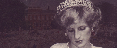
It is a combination of a wistful image of Diana and an image of the queens house completely surrounded by flowers left after her death. I think it really creates a feel of sadness and shows the drastic mourning the country and indeed the world went through. This coupled with the subtle film grain throughout really go a long way to tie it back to 1997.

Friday 22 February 2013

Class Crit

The class crit was where I showed my video to the class for them to evaluate. This is another invaluable tool. It allows the class to watch the entirety of my project and comment on the successes and failure. This peer review is a great exercise as it gives you a few days to really hone in on problems and aspects of your design you probably would have otherwise missed. You can quickly gain a myriad of different views and opinions and then use or discard them based on your own opinion. It is great to just polish an already finished project.

Overall the class really liked the video. They thought the composition, editing, colouring and cinematography was all really successful however, they had a few issues. The first was that there wasn't a strong enough tie in with the period that the speech was made. This is important because it is probably the main theme of the radio show we are supposed to be advertising. My tutor suggested adding stock footage or images. The second point was that some of the kinetic text isn't quite kinetic enough. They would have liked to have seen a little more movement and playfulness. 

Both of these points are very valid and something I really wanted to try and incorporate into the video. I was confused as to how though. On the kinetic text front, I really wanted to let the speech and the imagery do a lot of the talking and I thought having text whizzing around would be distracting and inappropriate. And with the time period point I didn't want to add in some really low quality footage as it would be such a leap from the sharp HD footage I had captured. I will describe how I overcame these issues in the next blog post.

Font Choices

I originally planned to use a wide number of fonts however, when it came time to start work on my project I had a change of heart. I think that simplicity and restraint are key themes that I need to keep to. A vast assortment of fonts would clutter the design and look a little congested and overly confusing. I want to narrow it down to one font face. This introduced an interesting dilemma. A serif or script font would fit the themes of elegance and regality however, with video it is something to be avoided because on a screen if it is moving or small in the frame it becomes hard to read and un-necasarily frivolous. A sans-serif font would be perfect for video and look aesthetically pleasing however, has limited ties to themes of elegance and regality. 

Overall I came to the decision that a sans-serif font is the only real option. Readability is paramount at the end of the day and also the sans-serif fonts tie into, arguably the main theme in the speech, newspapers and the media. This was enough of a factor for me to decide that I wanted to use a sans-serif font however, I then actually had to choose one. I wanted it to be both clean, crisp and modern whilst not being too ordinary and having a little flair to it. So not too showy but not bland and boring. This I felt represented Diana's qualities to a tee. In the end I plumped for the font Knockout in Bantamweight.


As you can see it is subtly stylised as apposed to something like Helvetica. It is a little taller and very professionally put together. It is a very aesthetically pleasing font and fits the imagery I have captured perfectly.

Friday 8 February 2013

Filming

The last few days I have done a lot of filming to place in the trailer. I feel as though I have stayed true to all of the themes and ideals I wanted to adhere to. It is elegant, simple, clean and pure. I shall place some raw, unedited images now to help illucidate my point:


As you can see all the shots are really simple and yet elegant. Some of the shots I got looked a little soft at full size and so I put these screenshots in Photoshop to do a little basic colour correction and grading. I also amended the aspect ratio to closer to a 2:1 ratio rather than the standard 16:9 as the more dramatic ratio gives it a much more cinematic look and helps to add panache.


I feel as though this grade really helps sell a elegant, simple look. I also really wanted the imagery to tie into Diana as a person. All the shots are quite simple and unassuming and yet, I think, powerful and emotive. These are exactly the things that Diana stood for as a symbol and a human being. She was quite subdued, peaceful and selfless yet was seen by the world as a global figure for charity and regality. I that the footage and this rough outline of a grade really go a long way to capture these themes and bring them to life. This emphasis on these ideas are not to garish and in your face either which I am really pleased with.

Design Changes

I was originally planning to use mainly stock footage and really literal interpretations of the spoken cues. This was flagged by the group as a possible issue and after re-reading the brief I have noticed the the trailer must not be a literal interpretation of what is said. This has made me re-consider my initial ideas and venture down a new path. 

I have now decided to film most if not all of the video myself. This makes it near impossible to be too literal with my footage as the majority of the speech is focussed around really personal issues and situations between Earl Spencer and Princess Diana. Filming everything myself will help to really, physically pull myself and the footage away from a straight forward and obvious standing and more towards the abstract. I shall film all around my local area to get really simple, scenic, calm, beautiful shots that will have subtle meanings and emotions wrapped around them which can be personal to whoever is viewing them with everyone having slightly different interpretations of what is shown.

I do not want to stray too far into the abstract space however. It has a tendency to get a little to extreme and odd. All meaning, relation and cohesion can be lost very easily. It is quite a hard thing to balance. I shall attempt to tackle this by sticking to a similar theme, setting and storyline. I want the trailer to flow; have a beginning, middle and end. I want it to have structure and themes. I am thinking of grounding it in the source material most probably through the use of the story of the train journeys Earl Spencer alludes to in the beginning section of the speech. This will be somewhat of a challenge balancing being too literal with being too abstract.

Monday 4 February 2013

Pitch Feedback

I recently made a pitch to the class offering up the ideas I have had so far and how they have begun to materialise. I always look forward to this process because it allows me to gain an outside viewpoint for my ideas and gain an impartial, critical analysis.

Overall the feedback was very positive. A lot of my class mates were doing some of the more famous, American speeches so I think it was refreshing to show a different society and point in time as the speech I have chosen was made very late in the 20th century. All aspects of my delivery and construction of the pitch were all well received however, there was one major concern raised.

The main thing that a few people pointed out was that they were worried I was going to be a bit too literal with the final design (something that the brief tells you to avoid). I hadn't really noticed that until the pitch and so it was good to hear it from everyone as now I see it. I think that all the aesthetic and audio choices were supported but it is the content that I need to be careful with. It is definitely something to bare heavily in mind when constructing my storyboard and the trailer.

Sunday 3 February 2013

Music

One of the first aspects I heavily considered was not the visual qualities but the audial ones. I cannot decide whether to include a music track along side the speech track. On the one hand music can really inspire emotion, add power and generally strengthen the imagery when the imagery is cut to a beat or time signature recognisable within a track. On the other hand it can detract from the power of a line due to the fact that you could not very clearly hear the subtle nuances in the voice where the speaker may dip in volume or crackle to show powerful emotion, a music track might just brush that aside. It is a very tricky issue.

There were a lot of choices when it came to song choices. Do I go instrumental? Or do lyrics help add emotion. One track that instantaneously jumped out to me was Elton John's "Candle in the Wind". It was written for Diana and played at her funeral. However, I quickly dismissed this as I think it is really cliché and would detract from the speech too much. This also made me realise that lyrics in the music is definitely something to avoid. It creates conflict with the words spoken and makes it unnecessarily complicated. Although they really help to convey emotion and ideas they have no place accompanying a speech in a trailer for BBC Radio 4.

After a while of pondering and a little trial and error I eventually narrowed down my music choice to one song. It is "Windows" by "The Album Leaf". It is a very powerful, swirling, instrumental piece with a lot of emotion and energy within it. It is a very pure, unrefined, delicate, natural song and I feel as though that it could not represent Princess Diana any better. The fit is perfect. This is the song:


As you can see it is an utterly suburb instrumental piece that would really fittingly accompany the tone and message of Earl Spencer's speech however, I feel as though the jury is still out as to whether or not I include it. I shall have to wait until delving into the editing process to really know for sure.

Detailed Research into Earl Spencer's Speech

I had been given a task of creating a presentation containing fairly detailed research into the subject matter of this speech and the speaker himself which I pitched to the class. This formed an excellent basis and foundation to begin with which I could then use to delve into aspects I felt to be important. These are the slides of the pitch:


Overall I think that I found a good amount out about the pitch that wasn't all trivial. Some of the economic and cultural details will play a large role in the structure and appearance of the finished product.

Blog Archive