This is going to be a overview of how I created each of the aspects for my posters. I am going to go through the majority of the steps to creating the final artwork without repeating myself too much.

I had to ensure that it was on a print profile to begin with. That was really the only thing to bear in mind. This allowed it to have a CMYK colour space and allowed it 300ppi (pixels per inch). This is the settings that print use however, web uses about 72ppi and an RGB colour space. I had to be careful to make sure that I had print selected as RGB and 72ppi would look fine on my screen but atrocious when printed.
Once this was complete I could get to work creating the artwork. I didn't trace any part of either of the posters I created. I put the picture up in the background off to the right of my workspace and then started trying to replicate it in my own style by eye.

The finished background: The wire frame:


I started by creating a document in Adobe Illustrator. The size had to be A1 which is not a preset in the program and so I had to research the dimensions over the internet which I found to be 841 x 594 mm. I entered this into the dialogue box and created the document:

Once this was complete I could get to work creating the artwork. I didn't trace any part of either of the posters I created. I put the picture up in the background off to the right of my workspace and then started trying to replicate it in my own style by eye.
For my first poster I used the pen tool pretty much exclusively and roughly drew out the proportions of each of the part of the scenery and any other features to form a basic layout:

It may not look like much but this was the first sketch I did and from there I could begin to add detail and do some proper drawings until I was left with the basic scenery which I then filled in the the gradient tool and regular fills until I was left with this:
The finished background: The wire frame:


Using the pen tool was simple you just click where you want a point and then click again in another location where you want another point. The program automatically connects the dots allowing you to create vast intricate shapes and lines. You can also click and hold then drag out a handle which allows you to create a curve. In the wire frame image the mountains and trees are a good example of just clicking to create points to create a very straight, sharp shape. At the bottom with the hills you can see how i used the click and drag method to create hills.
The gradient tool is also very simple you just need to open up the gradient tools specific dialogue window on the right hand side of the screen:
Once in here you can choose a range of colours that will all blend into one another for example here there is white into black. You can also specify the type of gradient; either linear or radial. Once you have specified each of these aspects you then just click within a shape you wish to colour and it will fill it completely with the gradient and give you two handles you can use to control it more precisely:

Once done with all this I then began to create the main art in my poster. I began with the cowboy and horse which I drew again using the pen tool:

Once he was drawn with his horse I then used the brush tool at quite a small size to add in light on his front:

I feel as though this really helps him stand out and draws attention to the character a lot better than if he were simply just blue and brown. Once he was drawn I then moved onto the text which I quite simply just used the text tool for making two text boxes and using the font "Cyclone" and "Cyclone Layers" created this title at the bottom of the page:

After this I then used the brush tool to create the smoke signals in the top right. I simply just drew out a shape then scribbled in to fill the middle. There was not need for a fill tool I just carried on the stroke:

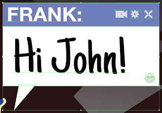
After this the only thing left to do was to add in the text boxes. For these I used a lot of tools I used the pen tool, the shape tool (to make a rectangle and a circle or two) and the text tool. I combined them all to create this:

Once this was created I simply duplicated it and switched around the text and moved the point over to make a reply coming from the smoke signals:

I then added a rectangle over the whole thing that was white but with lowered opacity to brighten everything up a little and was left with the finished poster:

No comments:
Post a Comment