The first point brought to light by the class was that the kinetic text wasn't quite kinetic enough. This seemed like a quick fix however, it was quite tricky to find a balance. There is a fine line between adding enough movement to the text to add interest/highlight a specific emotion and adding too much so that it looks cliché and over the top. I feel as though I did manage to find the balance eventually. Not only did I animate it more heavily I also added some more subtle intricacies that go a long way to adding some interest without being too over the top and flashy.
Here's an example of some text before:
And after:
As you can see I have just animated some masks across the text to make it look as though the twigs and branches and twigs in the foreground are intact, in the foreground and thus adding depth and realism to the typography.
The second point was hat the video didn't really have a strong enough connotation with the time period. Something important to the brief. I didn't want to add in ridiculously low resolution stock footage pulled from YouTube because I felt as though it would be quite a shock to the system as it was such a drastic change from crisp, colour graded HD footage. There was no real way to seamlessly combine the two. Instead I decided to try to add a subtle ageing to the grade and add in a collage of two images to help really resonate the sadness from the period.
This is one of the shots from the video before ageing:
And this is that same shot after some ageing:
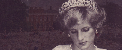
All I did to age it was to add in a little bit of film grain and a sharpening filter into the adjustment layer controlling all the colour correction, grade and aspect ratio crop. I also created and added in this image to really strengthen the ties to the era:
It is a combination of a wistful image of Diana and an image of the queens house completely surrounded by flowers left after her death. I think it really creates a feel of sadness and shows the drastic mourning the country and indeed the world went through. This coupled with the subtle film grain throughout really go a long way to tie it back to 1997.


No comments:
Post a Comment