Tuesday, 27 November 2012

Inspiration for the Art Style - Jon C. Lund

During my the process of idea generation I decided that I wanted to have quite a cartoony almost, American art style. I wanted it to be blocks of colour and simple shapes to illustrate rather intricate and complex ideas and imagery. I think the juxtaposition will create very interesting imagery whilst complimenting the era and theme to which the book is tied. I think illustrating something that is so widely accepted as being illustrated in a photo real, gritty manor in a more cartoony and soft fashion will work really well to make the cover more appealing and intriguing whilst still painting an accurate and true portrait of what lies within.

After a brief period of perusing various artists for inspiration a lecturer pointed me in the direction of Jon C. Lund. He is an artist based in Hudson, Ohio who draws artwork in a style very reminiscent of that from the first half of the 20th century. 

Here are some examples of his work:


This piece or artwork grabbed my eye instantaneously. The colours, the typeface and the composition all work together seamlessly and are a shining example of how relative simplicity can create such a stunning and attention grabbing piece of artwork. The style in which the back most buildings and hills are drawn is pretty simplistic however, it packs such a punch. this is the art style I want to try to replicate as it is perfect for what I am envisioning. The type face is also really aesthetically pleasing although a bit big and garish for my design and the colours, although vibrant and successful will be dialled back and made significantly darker for me.


This poster is closer in the font and colour department to how my design will hopefully be. the art style here is also outstanding. I am particularly fond of how all detail is lost in the shadows. There isn't a shred of shading or architecture underneath the blackened triangle of darkness cast by the road on the bridge. It is in a way simplistic ignorance, allowing your mind to fill in the blanks. I really, really like it and think it is definitely something I can carry forward when drawing the artwork for my cover. I think also the the typeface is very appealing and close to what I may end up choosing myself. It has a retro yet modern feel to it. It reminds me of a font they might have chosen in the 50's to illustrate the 21st century. It seems like an old fashioned idea of a futuristic font and I think it looks very unique and works really well. The way that he shadows it is also interesting. The font itself is dark and in the foreground with a subtle white outline to the lower left. It adds a shade of depth and readability to the font whilst still retaining it's aesthetic charm.


This is almost exactly how I want to illustrate the character on the cover. The man on the right is dressed similarly to that of a crime investigator from the period and location and is also lit in a very shady and period accurate way. The way that his entire face is featureless other than the mouth is a really intriguing aspect. It masks his identity and if it were on a book it may tempt the consumer into wanting to read the book just to see behind the mask and decipher his identity. The way that only 3 colours are used in his entire panel also interests me. I think the lack of colour and detail could both go towards creating a shady and film noir-esque atmosphere when applied correctly. This is a piece of work I will heavily draw inspiration from along with the second piece.

Jon C. Lund's style is very inspirational and unique. The way that things are just left out in the shadows, his minimalistic use of colours along side simple shapes that convey quite intricate imagery all go together to create really compelling imagery. I think that all of these aspects will all work together really well to create an interesting, appealing and attention grabbing book cover. The juxtaposition between both the content of the book and film noir against this cartoony, simplistic style will work really well and I have high hopes as it comes to beginning to create my artwork.

Monday, 26 November 2012

Inspiration for Typography - Jessica Hische

In graphical design typography is often overlooked however, it is essential and often can be a major selling point. Throughout the first half of the 20th century font faces were often very technical and intricate. They were all serif fonts with vast amounts of detail and shading and intricate patterns coming off the edges. This was seen as common place for many years and often the more intricate the better. In the 1950's however, swiss style came to fruition. This focussed on accuracy, control and precision. It did away with the ultra complex and intricate serif fonts of the past for a uniform sans serif font with mathematically sound spacing and positioning. This became the new standard and suddenly every shop and poster had a sans serif type face and as little text as possible.

It is only really in recent years we are starting to break away from this style trend and revert back to a more nostalgic style of typeface. One of the better examples I have found of this is the artist Jessica Hische's work. I was introduced to her by a university lecturer and her work is absolutely outstanding. She takes the old typographical elements of yesteryear and combines them with modern artistic styles. Her work has a very elegant, sophisticated, nostalgic feel yet still manages to look modern and vibrant.

Here are some examples of her work:


This poster combines a very grand old font that you might expect to see in a 1920's circus with a very modern style of composition and art style. The colours are reminiscent of older posters with a washed out blue and slightly off white text. The typeface in the bottom right also harks back to older poster designs. There is a great contrast though with the art style. Although the typeface is very complicated and sophisticated the background is sparse and simplistic. The positioning of everything is geometric and modern and the thin typeface in the top right coupled with the lines surrounding the main words really do help to emphasise the two contrasting periods of design. It is a very successful poster.


This poster is very, very aesthetically pleasing. It combines very bright, vibrant colours, artwork and composition with a very regal, British font family and decorative aspects. This poster is really successful at conveying the message it is supposed to. The colouring and changing font faces really help to emphasise each word giving them strength and meaning. It works really well and is immediately eye grabbing yet still holds your interest.

Jessica Hische's style is very iconic and successful. One of the major components to the success of this project is typography and I think that Jessica is a great artist to get inspiration from. I also thing this style of combining the old with the new and creating very interesting contrast works fantastically well and is something I shall delve into.

Sunday, 25 November 2012

Film Noir

This is a very important aspect of film history to take note of and take inspiration from. It came around in the 1940's and is largely thought to have run until the 1950's. It derives themes and aesthetic choices from German expressionist cinematography and, for the most part, combines that with hardboiled American crime fiction that was written during the depression.

The films are black and white with very high contrast. The term film noir is actually French, it means "black film". It is a very striking, extreme, gritty look which applies to the subject matter of a gritty crime thriller very aptly. Here are some stills to elucidate my point:


As you can see the very prominent and unique style to all of these examples is very identifiable. As I previously mentioned it is tied in with the crime thriller style very closely and is what I picture when I think of the fictional crime thriller genre. I can take points from this style and genre and apply them to my final design. The dark, seedy, gritty setting and imagery could be quite provocative and attention grabbing on a book cover.

Tuesday, 13 November 2012

Choosing a Book

I figured it'd be best to choose a book right at the beginning of the project. Having a set route to channel all of my ideas down I think will be very valuable as it will allow me to really focus on making the best design possible. My initial reaction when I read the brief was to go with "The Wind in the Willows". I am already somewhat familiar with the story and the graphical style that goes along with it. "The Big Sleep" intrigued me more. I have never read a crime fiction book and am unfamiliar with the art style that goes along with it. I have very briefly looked into film noir but never extensively. 

After some to'ing and fro'ing I have decided to go with "The Big Sleep". I thought that it would be important to step out of my comfort zone somewhat and try to generate ideas for something I am completely unfamiliar with. The childlike, friendly feel to the wind in the willows leads itself to a cartoony, vector style; the big sleep however, does not. Film noir is very photographic and real. It is gritty, black and white and striking which are aspects not necessarily tied into vector, cartoony imagery. This makes it more appealing to me as it presents somewhat of a challenge. I think that clean, vector style imagery can suit the theme of the book and film noir very well.

Vector artwork is sharp, clean and can be very detached from reality. Film noir is near enough the opposite. this creates a really intriguing contrast I think. The grittiness of the book will be complimented by the smooth, clean cover design and both with work together well.

Monday, 12 November 2012

Summary of the Brief

This is the second project in the first year of this course. I need to create a book cover for either "The Big Sleep" or "The Wind in the Willows" and then also rework the design to form an A2 poster that is marketing the re-launch of the book. 

  • The big sleep is a fictional story about a detective who is hired by a wealthy elderly man to help him with a problem. Whilst investigating this problem he witnesses a murder and is plunged into new depths.

  • The wind in the willows is a fictional children's book which focusses on woodland creatures in a rural English town. There are many different themes that can be gleamed from the book one of the more prominent ones is that of class struggle.

Obviously the two books have hugely different themes and evoke very different emotions. This will mean that the art style will be hugely different as will the ideas generated for it. The book cover must reflect the content and feel of the book and must be eye catching and evocative. Every aspect has to be carefully considered including the spine. This is the part of the book people will see in the book stores over the front cover or rear of the book as books are stacked so that the spine is on display.

Friday, 9 November 2012

Summary of AF102

I have now reached the end of the project and created two posters which both promote an aspect of social media in the style of propaganda posters from the early half of the 1900's. One is in the style of American tourism posters whilst the other is in the style of Russian constructivist propaganda. I chose both of these styles as they contrast each other a lot which would really stretch my designs. The American style is very clean, sharp and colourful. It was almost a cartoony style that was very light hearted and in some ways simplistic although the designs were sometimes complex. The Russian style is very off kilter, complex and eye grabbing. There is also a very limited colour palette to choose from so you have to be efficient and very conscious of everything you create to make sure it'll fit in to the colour scheme and work with a very limited array of colour.

My First Poster (American Tourism Propaganda):


This is my favourite design of the two. I really like how it all came together. It mirrors the original poster quite closely however, it was all drawn by eye and none of it traced so I like to think it has my own personal flair to all the artwork. I think it's simplicity is the main thing that makes it so aesthetically pleasing. There is just a view and 4 pieces of text. One image takes up the entire page and I think really works to grab the eye and make you read the text at the bottom. 

The class crit and the pitch were both invaluable tools for improving the design also. They allowed me to confirm that the message is getting through clearly enough and that the design is working to it's fullest potential. Thanks to the crit in particular I added in the lake behind the trees that really helps to add depth and separation between the foreground and the background. I also dialled back the colour on the hills as it was a bit garish and out of place. Both of these suggestions were things that hadn't occurred to me until they were mentioned but the second I changed them I really appreciated the difference and found they make such an improvement to the overall design.

It mirrors the style of American propaganda from this period very strongly too I feel. When looking a it everyone recognised the era and country of origin and it matches up with the art style of similar posters perfectly. It also simply promotes the aspect of social media successfully too. The chat windows will instantly strike a chord with anyone who uses Facebook chat and I think the slogan at the bottom is simple yet effective. Overall I think this is a really strong design.

My Second Poster (Russian Constructivist Propaganda):


This is my second design. This one is based upon Russian constructivist propaganda. This is pretty close to the polar opposite of the previous poster I created as it is very convoluted, complex and intricate. I wanted to do it like this as I felt it would stretch me more in Illustrator creating a tranquil, simplistic design and then creating a hectic, off the wall design immediately afterwards. Another contrast between the two was having one which was clean and another which is worn down having been folded, creased and just generally neglected. 

Again the crit and pitch proved very helpful. For this poster it was more in the pitch. I had only just begun creating this poster at the time of pitching my ideas and so I hadn't come too far with the design ideas. My original poster was very plain and con formative and the class really helped me to really get a grasp of what I wanted out of this design and helped me go forward, visualise it and ultimately create it.

This was my poster before the pitch:


As you can see it was very controlled and centred. The class suggested I play around more with angling everything at 45 degrees and playing around more with the colours and the font. I had already had these kinds of ideas in mind however, I wasn't sure if I was going to explore them for a final design as I wasn't sure of Illustrators capabilities for bringing to life what was in my head. The class seemed to really believe it was a good idea to try and explore however, and I am glad I did. I think the poster looks great all worn down and creased.

My finished poster really does reflect the style of Russian propaganda heavily which isn't as easy as it sounds. The artist I researched, Gustav Klutsis, pioneered a technique that involved blending photography and photographic styles in with colours and more abstract designs. This was a hard thing to wrap my head around as I was using a vector piece of software trying to replicate a photographic, bitmap style of image. I think that I pulled it off though. One of the main things that is attractive and immersive with bitmap imagery is clipping something behind another object. For example clipping the title of a magazine behind a models head. The audience knows that title wasn't actually behind her head at the time of taking that picture but the fact her head obscures the title somewhat adds a layer of depth and immersive-ness otherwise lost. This is what I did with the text by making it interact with the planet. I think it reflects Gustav Klutsis' style and has a look of controlled chaos. For these reasons I think it meets the brief very well.

What I Will Take Forward:

This project has been really helpful to me. I had never once used Illustrator before starting this course and it is now one of my new favourite programs in the Adobe suite. I have previously done a lot of work in After Effects, Premiere Pro, Photoshop and Cinema 4D and kept encountering problems in all 4 where I wanted to create a graphic but didn't seem to have the tools to do so effectively and efficiently. After just a short period of time with this project I feel that I have already found solutions to many of the problems I have had in the past with Adobe Illustrator.

Another thing is the value of research. In college research seems tedious and like you are just doing it for the sake of having something to put in your paperwork however, with this project I found it really immersive. I was finding an art style then an artist then all their work they had ever done. It was great to delve into an art style and movement so completely and draw ideas from it that would feed directly into my own designs. I found it really useful to have an idea in my head and try and visualise it in the art style of various artists from the period to see which would work most convincingly and so documenting my research became more of a part of my design process than merely a chore.

I have also learnt about the importance of sketching out your designs and keeping a sketchbook. At the beginning of the project everyone was stuck for ideas around me. I simply told them to draw in their sketchbooks 'till something came up and low and behold it did. I found this too, if I just sat and sketched out every idea that came into my head then at least one of them would appeal to me or would open up a new avenue in my thinking and allow me to develop the idea further. I am definitely going to try to spend more time in the next project sketching ideas from the get go as I feel like I left it a little late in this project and maybe having more time would have had a lot more ideas to run with.

Overall this project has helped me with every avenue of my design precess from idea generation through to execution of those ideas. Perhaps most valuable of all to me however, is the new string to my bow that I now have with Adobe Illustrator and I can see it becoming a pivotal member of my design generation process in the near future.

Thursday, 8 November 2012

Crit for Poster No.2

This post is for all the points brought to light when I showed the class my second poster and my views on the validity of each and my decision on whether or not to use them for the final submission.

Suggestion #1 - The Earth's shadow:

Original:
Suggestion:

This suggestion was to change the shadow on the Earth to make it darker. The original was more of a cartoony style and a bit lighter than the shadowing in the original poster. I have changed it to more closely match the colouring of the shadows in the original and I think that I prefer it. I may have to experiment further before making my mind up indefinitely.

Suggestion #2 - Brighten up the bottom:

Original:
Suggestion:

The idea here was to make it look as though the page was bending up a little bit and catching the light. I had done this subtly however, it wasn't as drastic as in the original poster. I simply added a gradient from 100% transparent white to 75% transparent white. This gives it a more intense look and really draws attention to the bottom half of the page and worn feel to the design. I think that this really looks good and unique and I am going to keep this through to my final design.

I think that these two suggestions have improved my design a lot and made it mirror the original and the style of Russian propaganda in general a lot better.

Crit for Poster No.1

I am going to discuss in this post each of the aspects my classmates and tutors put forward showing a before and after and then come to a decision on whether to take the advice or leave it explaining fully my reasons for doing so.

Suggestion #1 - The hills are too green:

Original:
Suggestion:

The first suggestion I got was to make the green less intense on the hills at the bottom as it was quite vibrant and garish. I added a little red and took out a little blue from the mix in the green in both of the hills and I think it is a vast improvement. I hadn't really noticed before but after it was mentioned I definitely agreed with the point and so I am going to keep this change.

Suggestion #2 - Add a lake:

Original:
Suggestion:

This was the second suggestion I got. It was to add a lake which the original poster had. The idea was to create depth and some separation from the trees to the mountain range in the background. I think that it really works. I was sceptical at first when I was originally creating the poster that it would look weird and not work at all however, after trying it out I think that it really works and so I am going to keep it in.

Suggestion #3 - Chat windows font:

Original:
Suggestion:

This suggestion was that the font choice in the chat windows did't really accurately reflect Facebook chat and that I should try and sans serif font. This is the first suggestion I don't agree with. The sans serif font looks out of place and wrong. I think that the original script font I picked out really adds a personal touch and helps to bridge the gap between the modern, sharp chat window and the rustic, soft artwork beneath. I am going to stick to my script font.

Overall all of the suggestions I got for this poster were spot on apart from the one about the font in the chat window boxes and I found the crit was invaluable and has really improved the design.

Process for Making my Posters

This is going to be a overview of how I created each of the aspects for my posters. I am going to go through the majority of the steps to creating the final artwork without repeating myself too much.

I started by creating a document in Adobe Illustrator. The size had to be A1 which is not a preset in the program and so I had to research the dimensions over the internet which I found to be 841 x 594 mm. I entered this into the dialogue box and created the document:


I had to ensure that it was on a print profile to begin with. That was really the only thing to bear in mind. This allowed it to have a CMYK colour space and allowed it 300ppi (pixels per inch). This is the settings that print use however, web uses about 72ppi and an RGB colour space. I had to be careful to make sure that I had print selected as RGB and 72ppi would look fine on my screen but atrocious when printed.

Once this was complete I could get to work creating the artwork. I didn't trace any part of either of the posters I created. I put the picture up in the background off to the right of my workspace and then started trying to replicate it in my own style by eye.


For my first poster I used the pen tool pretty much exclusively and roughly drew out the proportions of each of the part of the scenery and any other features to form a basic layout:


It may not look like much but this was the first sketch I did and from there I could begin to add detail and do some proper drawings until I was left with the basic scenery which I then filled in the the gradient tool and regular fills until I was left with this:


           The finished background:                                                             The wire frame:


Using the pen tool was simple you just click where you want a point and then click again in another location where you want another point. The program automatically connects the dots allowing you to create vast intricate shapes and lines. You can also click and hold then drag out a handle which allows you to create a curve. In the wire frame image the mountains and trees are a good example of just clicking to create points to create a very straight, sharp shape. At the bottom with the hills you can see how i used the click and drag method to create hills.

The gradient tool is also very simple you just need to open up the gradient tools specific dialogue window on the right hand side of the screen:


Once in here you can choose a range of colours that will all blend into one another for example here there is white into black. You can also specify the type of gradient; either linear or radial. Once you have specified each of these aspects you then just click within a shape you wish to colour and it will fill it completely with the gradient and give you two handles you can use to control it more precisely:


Once done with all this I then began to create the main art in  my poster. I began with the cowboy  and horse which I drew again using the pen tool:


Once he was drawn with his horse I then used the brush tool at quite a small size to add in light on his front:

I feel as though this really helps him stand out and draws attention to the character a lot better than if he were simply just blue and brown. Once he was drawn I then moved onto the text which I quite simply just used the text tool for making two text boxes and using the font "Cyclone" and "Cyclone Layers" created this title at the bottom of the page:


After this I then used the brush tool to create the smoke signals in the top right. I simply just drew out a shape then scribbled in to fill the middle. There was not need for a fill tool I just carried on the stroke:


After this the only thing left to do was to add in the text boxes. For these I used a lot of tools I used the pen tool, the shape tool (to make a rectangle and a circle or two) and the text tool. I combined them all to create this:


Once this was created I simply duplicated it and switched around the text and moved the point over to make a reply coming from the smoke signals:


I then added a rectangle over the whole thing that was white but with lowered opacity to brighten everything up a little and was left with the finished poster:


Wednesday, 7 November 2012

Decisions Behind Poster No. 2

This is the finished version (prior to class 'crit) of my second poster. This one was based upon Russian constructivism propaganda from the Second World War:
It is promoting Facebook's ability to allow you to connect with the world far more extensively and personally than ever before. I drew inspiration from this "Soviet Hands" poster:
I found the Russian propaganda really interesting due to its strong colour schemes and interesting layouts however, I chose this poster in particular for two main reasons. The first was it's off kilter composition. Everything was ay a 45 degree angle and some of the main text appeared to be clipping behind some of the imagery and off the page. And the second was how distressed and worn the poster was. This example here is the most vibrant and intact image I could find but you can still see visible distress and fading even on this poster.

I tried to mirror the design as closely as possible whilst still retaining some originality and clarity. I made sure that I made the poster very close to the original in terms of layout, composition, typeface and the level of distress and wear however, I did change the imagery and colour scheme marginally.

Typeface:

The original typeface:
My chosen typeface:
I feel as though my chosen typeface is fairly similar to the original. The problem with Russian style font faces is that they are not very easily readable, particularly at smaller sizes. I wanted to maintain the balance between readability and style which was quite tricky to do however, I think I found the balance. My chosen font face is a little sharper than the original however, I think that it works as it still looks powerful and sharp which are two major themes with Russian propaganda.

Colour:

The colours I have used in my design are a little more subdued than in this example of the poster. I wanted to experiment with making the poster look really distressed and worn. This included making the colours look faded and worn. It was quite different to my first poster and that was intentional so I could experiment with both styles.

Layout/Composition:

The layout is almost identical. The only real difference is that I made the text clip behind the Earth and the edge of the page more than the original as I felt that it was really unique and striking. The original came tantalisingly close to clipping the text in certain areas however, never actually did so I wanted to experiment to see how it would look. I think that it really works and looks really interesting. I definitely wanted to keep the 45 degree angle to everything however, as I felt it was really eye grabbing and interesting.

Additions:

The only real change is the image in the centre. The Earth and the like hands beneath it. Both are quite different to the original. The original focused around an actual photograph which is very different to the vector, computerised style of the Earth and hands at the bottom. I thought creating a soft, cartoony Earth would be quite a nice contrast and big eye grabbing feature to the poster however, I kept more to the Russian theme with the hands as they are very sharp and I think powerful. This pays homage to the original design whilst the Earth does the opposite and I think it is interesting and works well.

Tuesday, 6 November 2012

Decisions Behind Poster No. 1

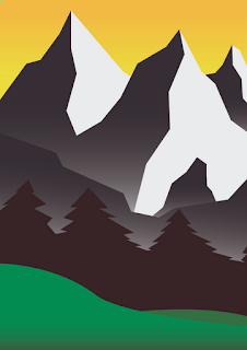
This is the finished version (prior to class crit') of my first poster. It is based upon a poster that was part of a campaign promoting the idea of visiting certain places in America: 
It is promoting the chat feature on Facebook and it's ability to enable you as the user to easily talk to their friends. I drew inspiration from this "See America" poster:
It's colours and art style really appealed to me as it was far more colourful, simplistic and calm than any other forms of propaganda I had previously seen. This I feel would help it stand out from other designs as I had the ability to utilise far wider array of font and colour choices. This I felt would allow me to really hone in on a style and have a greater amount of freedom.

I quite closely mirrored the original with the imagery, layout and typeface however, I feel that I have slightly modernised some aspects. I have kept it clean and vector and although still sticking fairly closely to the style and aesthetic appeal of the original type face I have chosen slightly more modern carnations of them.

Typeface:

The original typeface:
My chosen typeface:
I stayed true to the aesthetic qualities of the original with the beige font with a brown, thin interior however, I feel as though the look and formation of the letters is slightly more modern and appealing to the Facebook generation. The main difference comes with the secondary piece of text. In the original is is quite a square and short typeface however, the font I chose to use was very tall and narrow. It is also very thin. I think that this difference really works as it not only draws attention to the main reason for the poster (the words "Use Facebook") it also creates really nice contrast which I think is really appealing and really completes the look, particularly because of the more modern and vibrant colours.

Colour:

The colours were another aspect that I changed very slightly. In the original all of the colours were very slightly washed out and fairly dark. In my design I made them a little more vibrant and a little brighter. I think that it compliments the modern aspects I brought in with the typeface and the chat windows and just really helps the poster pop and grab the eye. In my second poster I really washed out the colours and experimented with the more run down and desolate feel so I wanted to keep this poster vibrant and a bit more lively as I felt it really lends itself to the style of the period I chose. The only reason that the example of the "See America" is washed out and dark is that is an old, worn out copy that has been scanned into the computer. When it was made it too would have been vibrant, bright and colourful. As are other examples of posters from the same time period that are in slightly better condition.

Layout/Composition:

The layout and composition in the original poster I think was one of the strongest aspects due it's sheer simplicity. The bottom third contained all the information then the top two thirds contained nothing but a view of the mountains. It was really successful at selling the idea of visiting Montana because you actually looked that the imagery and the poster as if it was a view of a mountain range by reading the text at the bottom then following the cowboys eye. I stayed very true to this and made sure to mirror the composition and layout as closely as I could. I used the eye of the cowboy to create a line between the two chat boxes. You would follow his view through the first box and up to the second. I think this is really important as it makes sure that the audience know there is a conversation taking place between the cowboy and a person sending smoke signals from the mountains and not just two random statements.

Additions:

These are the only two things completely original that I added to the poster which weren't in the original design:
The smoke signals I made with the brush tool and I think that I managed to keep the clouds in tact with the art style of the rest of the poster. A lot of the poster is very sharp and angular and obviously clouds aren't that. I think that the best way I could have drawn it was with the brush tool as it makes them look a lot more fluffy due to the smoothing feature of the tool. the colouring was just trial and error. I think it fits in with the overall lighting and atmosphere of the poster.

The chat windows were another issue:
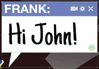
These were no where near being in the design. I knew that I wanted to have the Facebook chat windows in the design as it would really help to hammer home the brand identity. I chose to just create a speech bubble type of effect but make it as angular as I could. This I think matches with the mountains in the top half and suits the design. It ties in well with the font choice at the very bottom too and overall I think was the only way of executing this idea.

Blog Archive